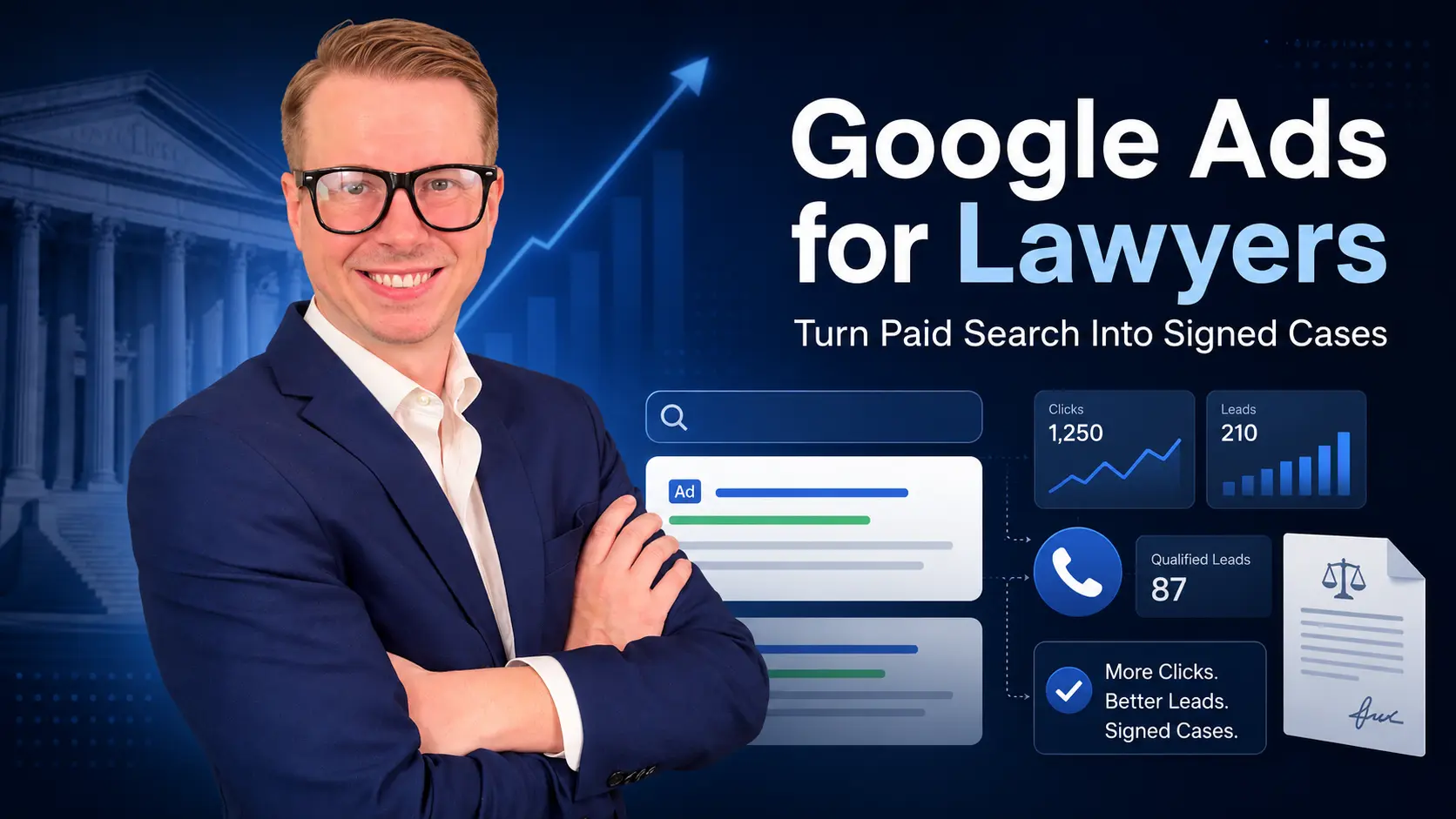
Google Ads for Lawyers: How Law Firms Can Turn Paid Search Into Signed Cases
Google Ads for lawyers can help law firms appear in front of people who are actively searching for legal help,…

A law firm landing page is a focused web page built to turn legal traffic into one clear action, usually a phone call, consultation request, or intake form submission. Unlike a homepage, which introduces the entire firm, a landing page is designed around one practice area, one audience, one message, and one conversion goal.
That matters because legal traffic is expensive and competitive. If a law firm is paying for Google Ads, Local Service Ads, SEO, social campaigns, or retargeting, the destination page has to do more than look professional. It has to help the visitor understand that they are in the right place, trust the firm quickly, and take the next step without confusion.
At BestLawFirmAds, we believe law firm landing pages should be built around qualified leads and signed cases, not vanity traffic. A page that gets clicks but does not generate real consultations is not doing its job.
The best law firm landing pages connect traffic, message, trust, intake, and tracking. They turn a visitor’s legal concern into a clear path forward.
Law firm landing pages convert best when they match the visitor’s legal problem, show practice-area and local relevance, build trust quickly, and make the next step easy through a phone call or short form. A high-converting legal landing page is not just a nice design; it is a conversion system that connects traffic, trust, intake, and signed cases.
The best law firm landing pages have one clear goal, one legal topic, one primary CTA, strong trust signals, mobile-first design, fast loading speed, and conversion tracking that separates raw leads from qualified consultations. A personal injury visitor, criminal defense visitor, divorce visitor, immigration visitor, and estate planning visitor should not all be sent to the same generic page because each person has a different legal problem and different urgency level.
For PPC landing pages, message match is especially important. The keyword, ad copy, landing page headline, page content, and CTA should all speak to the same legal need. If someone clicks an ad for a truck accident lawyer, the page should not feel like a general personal injury brochure. It should immediately confirm that the firm handles truck accident cases and explain what the visitor should do next.
For SEO landing pages, the page should do two jobs at once: answer the visitor’s main questions and guide them toward contact when they are ready. The best SEO landing pages for law firms combine helpful explanation, local relevance, clear structure, trust signals, and simple conversion paths.
A law firm landing page is a focused web page designed to convert visitors into legal leads by guiding them toward one action, such as calling the firm, requesting a consultation, or submitting an intake form.
A landing page is different from a standard website page because it is not meant for general browsing. It is usually built for a specific campaign, practice area, location, or type of legal visitor. The goal is to reduce distraction and make the next step obvious.
Law firm landing pages are often used for:
For example, a law firm running ads for “Phoenix car accident lawyer” should not send that traffic to a broad homepage that lists every service the firm offers. A better landing page would focus on car accident cases in Phoenix, explain how the firm helps injured drivers, include a click-to-call button, show relevant trust signals, and invite the visitor to request a case review.
The main idea is simple: one visitor, one legal problem, one page, one next step.
A law firm landing page is not just a page design. It is the conversion layer between legal traffic and signed cases.
A law firm landing page and a homepage serve different purposes. A homepage introduces the whole firm. A landing page converts a specific type of visitor.
This difference matters because many law firms waste valuable traffic by sending everyone to the same general page. That may work for branded searches, but it is usually weaker for paid search, practice-area campaigns, and high-intent legal traffic.
A homepage is the front door of the law firm’s website. It usually explains who the firm is, where it is located, what practice areas it handles, and why someone might choose the firm.
A homepage is useful for visitors who already know the firm’s name or want to explore the full website. It may include links to multiple services, attorney bios, blog posts, testimonials, contact information, and firm background.
A homepage is best when the visitor searches the firm’s name, wants general information, or needs to explore multiple services before deciding where to go.
But that broad purpose is also the homepage’s weakness. If someone clicks a paid ad for a specific legal problem, the homepage may create too many choices and not enough direct relevance.
A landing page is built for a narrower purpose. It focuses on one practice area, one audience, one location, or one campaign.
A strong legal landing page usually removes distractions, limits unnecessary navigation, and guides the visitor toward one primary CTA. That CTA may be calling the firm, requesting a consultation, submitting an intake form, or starting a case review.
A landing page is best when the visitor clicks a Google Ad, responds to a campaign, searches for a specific practice area, or needs a clear consultation path.
For example, a divorce landing page should speak to divorce concerns. A DUI landing page should speak to urgency, charges, court dates, and confidentiality. A personal injury landing page should speak to injuries, insurance, medical bills, and case reviews.
Use the homepage when the visitor is searching for the firm by name, comparing the firm generally, learning about multiple services, or exploring the website.
Use a landing page when the visitor has a specific legal problem, clicks on an ad, comes from a campaign, searches for a practice-area keyword, or needs a direct path to contact.
For law firm marketing, both pages matter. The homepage builds the broader brand. Landing pages turn specific legal intent into action.
Most legal landing pages fail because they are too generic, too slow, too cluttered, too self-focused, or too disconnected from the visitor’s actual legal problem.
A legal visitor does not arrive on a landing page in a neutral state. They may be injured, scared, accused, confused, embarrassed, overwhelmed, or comparing several firms quickly. If the page does not make them feel understood within a few seconds, they may leave.
Many weak law firm landing pages begin with firm-centered claims:
Those statements may be true, but they do not always connect to the visitor’s immediate concern.
Better copy speaks to the person’s situation first:
Client-centered copy does not ignore the firm’s credentials. It simply starts where the visitor is emotionally and practically.
A good legal landing page makes the visitor think, “This firm understands my problem.”
A law firm that sends every campaign to the same page usually creates a relevance problem. A person looking for a truck accident lawyer has different concerns than someone looking for an estate planning attorney. A person facing criminal charges has different urgency than someone researching business contracts.
Different legal problems need different landing pages because the visitor’s questions, fears, objections, and next steps are different.
A strong landing page strategy separates major practice areas and campaign types. Personal injury, criminal defense, family law, immigration, estate planning, employment law, and business law should not all be forced into the same generic conversion path.
Friction is anything that makes it harder for the visitor to take action.
Common landing page friction includes:
A legal landing page should reduce effort. The visitor should not have to hunt for the phone number, wonder whether the firm handles their matter, or guess what happens after they submit a form.
Many law firms measure landing page performance by raw form submissions or calls. That is not enough.
A page can generate many leads and still perform poorly if those leads are unqualified. The real conversion path looks like this:
If the firm only tracks the first few steps, it may make bad marketing decisions. A page with fewer leads but better signed-case quality may be more valuable than a page with many low-quality inquiries.
High-converting law firm landing pages are built around clarity, trust, relevance, and action. They do not try to impress every visitor with everything the firm does. They guide the right visitor toward one next step.
The headline should immediately confirm the visitor is in the right place.
A headline like “Phoenix Car Accident Lawyer” is usually stronger than “Legal Help You Can Trust” because it matches the visitor’s search intent.
A strong headline may include:
Examples include:
The headline should not be clever at the expense of clarity. Legal visitors are often stressed. They need quick confirmation, not vague branding.
Most legal searches have a local component. Even when the legal issue is not strictly local, clients often want a lawyer who understands their area, courts, judges, procedures, or state law.
Local relevance can include:
Local relevance should be real, not forced. A page should not pretend to be local if the firm does not actually serve that area.
A landing page should have one main action. That does not mean the page can only have one button. It means every button and prompt should point toward the same goal.
Common law firm landing page CTAs include:
The best CTA depends on the practice area. A criminal defense page may need urgency. A family law page may need confidentiality. An estate planning page may need calm planning language.
A landing page form should ask for enough information to respond, but not so much that the visitor gives up.
Low-friction form fields usually include:
Some firms may need additional qualifying questions, especially for expensive or complex practice areas. But the form should still feel simple.
A form that looks like homework can kill conversions.
Click-to-call is essential for law firm landing pages, especially on mobile. Many legal prospects prefer calling because their issue feels urgent, emotional, or complicated.
A click-to-call button should be visible near the top of the page and repeated at natural decision points. It should be easy to tap with a thumb and should not be hidden behind a menu.
For urgent practice areas like criminal defense, personal injury, protective orders, or emergency custody, phone calls may be the most important conversion action.
Legal prospects need confidence before contacting a firm. They may be skeptical, nervous, embarrassed, or unsure whether their issue is serious enough to call.
Useful trust signals include:
Trust signals should be specific and truthful. Generic claims like “trusted by many” are weaker than real, verifiable proof.
Law firm landing page copy should sound like it was written for real people, not for attorneys reviewing their own credentials.
Good copy explains the visitor’s problem in plain language, shows how the firm can help, and gives a clear next step. It should not overwhelm the visitor with legal jargon.
For example, instead of saying, “Our firm provides comprehensive representation in motor vehicle tort claims,” a better landing page might say, “After a serious crash, you may be dealing with medical bills, insurance calls, and missed work. A car accident lawyer can help you understand your options before you speak further with the insurance company.”
A legal landing page must work well on mobile. Many legal searches happen on phones, especially when the person needs immediate help.
A mobile-first page should have:
If a page looks good on desktop but feels frustrating on a phone, it may lose the leads that matter most.
The visitor should know what happens after they contact the firm.
A landing page can reduce uncertainty by saying things like:
This matters because legal consumers may hesitate if they do not know whether they are committing to something, whether the call is confidential, or whether they will be pressured.
A strong law firm landing page should follow a logical structure. The page should answer the visitor’s biggest questions in the order they are likely to ask them.
The hero section is the first visible part of the landing page. It should quickly tell the visitor where they are, what the firm helps with, and what to do next.
A strong hero section includes:
Example:
“Phoenix Car Accident Lawyer”
“Injured in a crash? Talk to a local attorney about your options before dealing further with the insurance company.”
“Call Now” or “Request a Free Case Review”
The hero section should not be overloaded. It should make the first decision easy.
After the hero, the page should explain the visitor’s problem in plain language. This is where the page shows empathy and relevance.
For a personal injury page, this may include medical bills, missed work, insurance adjusters, and uncertainty about fault. For a criminal defense page, it may include court dates, license issues, jail risk, and fear about the future. For a family law page, it may include custody, support, property division, and emotional stress.
The problem section should make the visitor feel understood.
This section should explain why the firm is a good fit without relying on vague claims.
Strong trust points may include:
Instead of saying “We are the best,” explain what makes the firm helpful for this specific visitor.
Many legal prospects do not know what happens after they call. A simple process section can reduce fear and confusion.
Example process:
This section does not need to be long. It needs to make the process feel understandable.
Proof helps the visitor trust the firm before reaching out.
Depending on the practice area and jurisdiction, proof may include:
Everything in the proof section should be accurate, substantiated, and compliant with attorney advertising rules.
A landing page FAQ section can answer objections before the user leaves. It can also help with SEO and AI visibility when written clearly.
Good FAQ topics include:
The final CTA should repeat the main action without adding friction.
A strong final CTA might say:
“If you need legal help, the next step is simple. Call the firm or submit the form to request a consultation.”
The final section should not introduce a new offer or distract the visitor. It should reinforce the same action the page has been guiding them toward all along.
PPC landing pages for lawyers need to be more focused than general website pages because every paid click costs money. A general page may introduce the firm, but a PPC landing page has to match the keyword, ad, and legal problem immediately.
When a law firm runs Google Ads, the visitor arrives with a specific search intent. If the page does not match that intent, the visitor may leave quickly and the ad spend is wasted.
This is why strong Search Ads for Law Firms should be paired with dedicated landing pages. Paid search works better when the campaign, keyword, ad, landing page, CTA, and intake process all support the same goal.
A search for “truck accident lawyer in Dallas” should not land on a generic personal injury page. It should land on a truck accident page that mentions Dallas, truck crash claims, commercial vehicle issues, insurance complexity, and how the firm helps injured people after serious accidents.
Keyword-to-page match helps the visitor feel that the page was built for their exact problem.
Examples:
The landing page should also match the promise made in the ad.
If the ad says “Free Case Review,” the page should clearly repeat that language if it is accurate and compliant. If the ad promises “Confidential Consultation,” the page should support that message. If the ad focuses on “Car Accident Lawyer in Phoenix,” the page should not switch to generic personal injury messaging.
This is part of landing page experience. The more useful, relevant, and expected the page feels after the ad click, the stronger the user experience becomes.
Paid traffic should not be sent to pages with too many exits.
A PPC landing page does not need to link to every blog post, attorney bio, practice area, and firm update. The goal is to keep the visitor focused on the action that matters.
That does not mean the page should feel thin or untrustworthy. It means the page should remove unnecessary choices and make the consultation path clear.
Every PPC landing page should have tracking in place before the campaign launches.
Important tracking points include:
Without tracking, the firm may know how many clicks it bought but not whether those clicks produced real opportunities.
Law firm SEO landing pages serve a slightly different role than PPC landing pages. PPC pages usually focus heavily on immediate conversion because the click was paid. SEO pages often need to rank, answer questions, build trust, and convert visitors who may be at different stages of the decision process.
A strong SEO landing page can still be conversion-focused. It just usually needs more supporting content than a paid search page.
Organic visitors may not be ready to call immediately. They may be comparing firms, trying to understand a legal process, or deciding whether they need a lawyer.
An SEO landing page should usually include:
The goal is to answer enough of the visitor’s questions to earn trust while still making contact easy.
Some law firms make the mistake of treating SEO pages like information pages only. That can bring traffic but fail to produce leads.
Every SEO landing page should still have a logical next step. The CTA can be softer than a PPC page, but it should be visible and relevant.
Examples include:
An SEO landing page should help the visitor learn, but it should not leave them wondering how to contact the firm.
Blog posts and landing pages are different tools.
A blog post usually answers a specific question, such as “What should I do after a car accident?” or “How does child custody work?” A landing page targets service intent, such as “car accident lawyer” or “child custody attorney.”
Blog posts can support landing pages through internal links. Landing pages can convert visitors who are closer to hiring.
A strong law firm website needs both.
Law firm landing page copy should be clear, specific, ethical, and client-centered. It should help the visitor understand their next step without overwhelming them or making promises the firm cannot make.
The best legal landing page copy sounds like it was written for the client, not for another lawyer.
Problem-aware copy starts with the visitor’s situation.
Examples:
“After a serious crash, you may be dealing with medical bills, insurance calls, and missed work.”
“A DUI arrest can affect your license, job, and future.”
“Custody disputes can feel overwhelming when your child’s routine is at stake.”
“Immigration paperwork can feel confusing when your family, job, or status depends on the outcome.”
“Estate planning can feel easy to delay until your family needs documents you do not have.”
This type of copy helps the visitor feel seen. It also makes the page more relevant to the legal issue that brought them there.
A strong landing page should tell the visitor what happens after they call or submit a form.
For example:
“After you contact the firm, the intake team will ask a few basic questions about your situation and help determine whether the firm may be able to assist.”
This reduces uncertainty. Many people hesitate to contact a lawyer because they do not know what the call involves, whether they will be charged, or whether they are committing to representation.
Law firm landing pages should avoid vague or risky claims, especially if they are not substantiated.
Avoid language like:
A landing page can be persuasive without being reckless. Stronger copy is usually specific, accurate, and useful.
Legal consumers are often stressed. They may not know legal terminology. They may be reading quickly on a phone.
Simple language usually converts better than complex legal language.
Instead of saying:
“Our firm provides litigation counsel in complex motor vehicle negligence matters.”
Say:
“If you were hurt in a crash, we can help you understand your options and what to do before speaking further with the insurance company.”
Clear copy builds confidence. Confusing copy creates hesitation.
Landing page design for lawyers should reduce friction, build trust, and guide the visitor toward action. Design is not just about appearance. It affects whether the visitor understands the page, trusts the firm, and contacts the office.
A beautiful page that loads slowly, hides the phone number, or buries the form is not a high-converting landing page.
Most legal prospects will view the page on a phone, especially in urgent practice areas. Mobile design should not be an afterthought.
A mobile-first law firm landing page should include:
A mobile visitor should be able to understand the offer and contact the firm within seconds.
Visual hierarchy means the most important information is easiest to see first.
For law firm landing pages, the hierarchy should usually be:
If the visitor’s eye goes first to a decorative image, a vague slogan, or a cluttered menu, the page may be working against conversion.
Slow pages waste traffic. This matters even more for mobile visitors and paid search campaigns.
A landing page should avoid unnecessary heavy images, bloated scripts, autoplay videos, and cluttered design elements that slow down loading. The page should feel fast and easy.
A page does not need to be plain, but performance should come before decoration.
Forms should appear where the visitor is likely to act. Many law firm landing pages place a short form near the top and repeat the form or CTA lower on the page.
Good form placement can include:
The form should not feel hidden. If the page asks the user to contact the firm, the contact path should always be easy to find.
Accessible, readable pages help all users.
Good readability includes:
Law firm landing pages should not feel dense or intimidating. The visitor should feel guided, not overwhelmed.
The best CTA for a law firm landing page matches the legal problem, urgency level, and emotional state of the visitor.
A personal injury visitor may want to know whether they have a claim. A criminal defense visitor may need immediate help. A divorce visitor may want confidentiality and calm guidance. An estate planning visitor may want clarity and peace of mind.
Strong personal injury CTAs include:
These CTAs work because personal injury prospects often want to know whether their situation is worth pursuing and what the insurance company may do next.
Only use “free” or “no fee unless recovery” language if it is accurate, compliant, and approved for the jurisdiction.
Strong criminal defense CTAs include:
Criminal defense CTAs should reflect urgency, privacy, and immediate next steps. People facing charges often need fast guidance.
Strong family law CTAs include:
Family law CTAs should feel calm and respectful. The visitor may be dealing with divorce, custody, support, or conflict at home. The tone should not feel overly aggressive.
Strong estate planning CTAs include:
Estate planning CTAs often work best when they focus on clarity, protection, and peace of mind.
The best CTA is not always the loudest. It is the one that matches the visitor’s reason for being on the page.
Law firm landing page forms should reduce friction while still collecting enough information for the firm to respond. The right number of questions depends on the practice area, lead quality needs, and urgency.
Short forms usually increase submissions. Longer forms may improve qualification but can reduce conversion volume.
The key is balance.
Most law firm landing pages can start with basic fields:
These fields are enough for many first-contact situations. The firm can ask deeper questions during intake.
For mobile users, fewer fields usually perform better. If the visitor is stressed or in a hurry, a long form can cause abandonment.
Some landing pages may need a few qualification questions, especially when paid traffic is expensive or the firm receives many unqualified leads.
Useful qualification questions may include:
These questions should be used carefully. Each extra field adds friction.
A landing page form should not feel like a legal questionnaire unless the firm has a strong reason for asking detailed questions upfront.
If the form feels too long, the visitor may leave and call another firm. This is especially true for urgent matters.
A better approach is often to ask for enough information to start the conversation, then let intake handle the deeper screening.
Not every visitor wants to fill out a form. Many legal prospects would rather call.
The page should support both contact styles:
Some users want speed. Others want privacy. A good landing page gives both options without creating confusion.
Trust signals help legal landing pages convert because potential clients often need reassurance before contacting a law firm. They may be worried about cost, confidentiality, judgment, case value, or whether the firm can actually help.
A landing page should build trust quickly and honestly.
Strong legal landing page trust signals may include:
Reviews and testimonials can help visitors feel that real people have trusted the firm before. They are especially useful when the page is targeting people who are comparing several attorneys.
Reviews should be used carefully. The firm should follow bar rules, platform rules, and jurisdiction-specific advertising guidance. Avoid editing reviews in misleading ways or implying guaranteed outcomes.
Attorney photos make the page feel human. Many visitors want to know who they may be speaking with before they call.
A short attorney bio can help if it is relevant to the landing page. It should not turn into a full resume. The goal is to build confidence without distracting from the conversion path.
Useful bio details may include:
Case results and awards can support trust when they are accurate, substantiated, and compliant. They should never imply that the same result will happen for every client.
If case results are not appropriate or approved, the page can still build trust through reviews, attorney credentials, process clarity, and local relevance.
Local proof can make a legal landing page more believable.
Examples include:
Legal clients often want someone who understands their area. Local proof helps support that confidence.
Law firm landing pages should change by practice area because each legal service has different urgency, trust concerns, search behavior, and conversion triggers.
A one-size-fits-all page usually weakens relevance.
Personal injury landing pages should focus on injuries, insurance issues, medical bills, missed work, and case evaluation.
A strong personal injury landing page may include:
Personal injury visitors often want to know whether they have a claim and whether the firm can deal with the insurance company. The page should make that next step clear.
Criminal defense landing pages should focus on urgency, confidentiality, charges handled, court dates, and immediate next steps.
A strong criminal defense landing page may include:
A person facing criminal charges may be worried about jail, license suspension, employment, immigration consequences, or reputation. The page should speak directly to that urgency without making guarantees.
Family law and divorce landing pages should balance clarity and sensitivity. The visitor may be dealing with emotional conflict, children, finances, housing, or safety concerns.
A strong family law landing page may include:
Family law copy should avoid sounding too aggressive. The visitor often wants control, privacy, and guidance.
Immigration landing pages should focus on service type, process clarity, documentation concerns, and trust.
A strong immigration landing page may include:
Immigration visitors may be worried about status, deadlines, family separation, or government processes. The page should reduce confusion and show that the firm handles the specific issue.
Estate planning landing pages should focus on peace of mind, family protection, and clear planning options.
A strong estate planning landing page may include:
Estate planning visitors may not feel urgency, so the page should make the benefit of acting now clear without using fear-based language.
Business and employment law landing pages often need stronger qualification because the visitor’s issue may vary widely.
A strong business or employment landing page may include:
For employment law, the page should clarify whether the firm represents employees, employers, or both. For business law, the page should clarify whether the firm handles contracts, disputes, formation, compliance, or outside counsel matters.
A law firm landing page should not be judged only by page views. It should be judged by whether it produces qualified consultations and signed cases.
A page with high traffic and low lead quality may look good in analytics but fail the business. A page with fewer visitors and stronger signed-case outcomes may be far more valuable.
Important law firm landing page metrics include:
Tracking should connect marketing activity to business outcomes. The goal is not just to know how many people visited the page. The goal is to know which visitors became real opportunities.
Raw leads include every call, form, or chat submission. Qualified leads are the leads that match the firm’s practice area, location, case criteria, and client fit.
This distinction matters because a landing page can increase raw leads while lowering overall quality. That is not a win if the intake team spends more time on bad inquiries.
The page should be evaluated by lead quality, not just lead volume.
Cost per signed case is one of the most important metrics for law firm landing pages, especially when the page supports PPC or paid campaigns.
For example, a page may generate leads at a higher cost but produce better signed cases. Another page may generate cheap leads that never become clients. The second page may look better in basic reporting but perform worse for the firm.
The most valuable landing pages help turn marketing spend into real matters.
Landing page performance depends on intake. If the firm misses calls, responds slowly, fails to follow up, or does not record lead quality, the page may be blamed for problems that happen after conversion.
That is why landing page data should connect to intake feedback. BLFA’s guide to law firm intake automation explains how faster response, better routing, and better intake systems can help firms turn more inquiries into consultations.
A landing page creates the opportunity. Intake determines whether that opportunity becomes a signed case.
Improving a law firm landing page does not always require a full redesign. Some of the highest-impact changes are simple, practical, and tied to user intent.
Make the headline match the legal problem and location.
A headline like “Phoenix Car Accident Lawyer” is stronger than “We Fight for Justice” because it gives the visitor immediate confirmation.
Make the phone number and form easy to find. The main CTA should appear near the top and repeat at natural points throughout the page.
Use CTA language that matches the practice area. A criminal defense page may need urgency. A family law page may need confidentiality. An estate planning page may need calm planning language.
Remove fields that are not necessary for first contact. Ask for the basics, then let intake handle deeper screening.
A shorter form can reduce friction, especially on mobile.
Add attorney photos, reviews, credentials, local relevance, and proof where appropriate. Trust signals should appear early enough to matter, not only at the bottom of the page.
Test the page on a real phone. Look for slow loading, hard-to-click buttons, tiny text, forms that are hard to complete, and popups that block the CTA.
Mobile experience can make or break a legal landing page.
Keep the page focused on one action. Remove unnecessary links, cluttered navigation, unrelated content, and design elements that do not help the visitor decide.
Use conversion tracking to understand which traffic sources and pages produce meaningful actions. For law firms, that often includes calls, forms, chats, booked consultations, and signed cases.
Ask which leads became consultations and which became signed clients. If many leads are unqualified, the page may need clearer copy, better filtering, or different traffic targeting.
Avoid changing everything at once. Test one major change, review performance, then continue improving.
Good landing page optimization is a process, not a one-time edit.
A high-converting law firm landing page should include the elements that help the right visitor understand the page, trust the firm, and take action.
Use this checklist before publishing or rebuilding a legal landing page:
The checklist matters because landing page success depends on the full system. A strong headline will not fix a slow page. A beautiful design will not fix weak tracking. A good form will not fix poor intake response.
The best law firm landing pages align message, design, trust, tracking, and follow-up.
Law firms can build landing pages themselves, but legal landing pages require more than basic design. They need legal-specific copy, conversion structure, compliance awareness, tracking, mobile performance, and intake alignment.
A DIY page may work for a simple campaign or low-risk test. But if the firm is spending heavily on PPC, competing in a crowded market, or struggling with lead quality, a specialist may produce better results.
A law firm may be able to build its own landing page if:
Even then, the page should follow conversion basics: one practice area, one CTA, short form, mobile-first design, trust signals, and tracking.
A law firm should consider hiring a landing page or legal marketing specialist if:
Professional Website Development for Law Firms should focus on more than aesthetics. The page should be built to attract, engage, convert, track, and support the firm’s intake process.
A law firm does not need a prettier page. It needs a page that helps turn legal traffic into real opportunities.
Need landing pages that turn legal traffic into signed cases? Contact BestLawFirmAds to build conversion-focused law firm landing pages for PPC, SEO, and intake-driven growth.
A law firm landing page is a focused web page built to convert legal visitors into calls, form submissions, consultations, or intake leads. Unlike a homepage, it usually targets one practice area, location, campaign, or legal problem. Its goal is to guide the visitor toward one clear next step, such as calling the firm or requesting a consultation.
A law firm landing page converts when it matches the visitor’s legal problem, shows local and practice-area relevance, builds trust quickly, loads fast on mobile, and makes contact easy. The strongest pages use clear headlines, short forms, click-to-call buttons, attorney trust signals, simple copy, and tracking that separates raw leads from qualified consultations.
Law firms should usually send non-branded Google Ads traffic to a dedicated landing page, not the homepage. A landing page can match the keyword, ad copy, practice area, and visitor’s legal problem more closely. A homepage is better for branded or general traffic, while PPC traffic usually needs a focused conversion path.
A lawyer landing page should include a practice-area headline, local relevance, clear CTA, phone number, short contact form, attorney or firm trust signals, client-centered copy, explanation of next steps, FAQs, and conversion tracking. The page should be mobile-friendly and focused on helping the visitor contact the firm without confusion.
A law firm landing page should be long enough to answer the visitor’s main questions and build trust, but focused enough to avoid distraction. A PPC landing page may be shorter and more direct. An SEO landing page may need more explanation, local relevance, FAQs, and supporting content to rank and convert.
A good CTA for a law firm landing page matches the visitor’s legal issue and urgency. Examples include “Request a Free Case Review,” “Schedule a Confidential Consultation,” “Speak With a Lawyer Today,” and “Find Out If You Have a Claim.” The CTA should be clear, accurate, compliant, and easy to act on.
Law firm landing pages can help SEO when they are built as useful, indexable practice-area or location pages with helpful content, clear structure, and search intent alignment. PPC-only landing pages may be shorter and more conversion-focused, while SEO landing pages usually need more context, FAQs, internal links, and local relevance.
Law firm landing page performance should be tracked through calls, forms, chats, qualified leads, booked consultations, signed cases, source attribution, lead response time, and cost per signed case. Page views alone are not enough. The page should be judged by whether it creates qualified legal opportunities and real clients.
The biggest legal landing page mistakes include generic copy, weak CTAs, long forms, slow mobile pages, no trust signals, sending paid traffic to the homepage, poor tracking, and no intake feedback. Many pages fail because they focus on design or traffic instead of the full path from visitor to qualified lead to signed case.
One landing page should not usually be used for every practice area. Each major practice area should have its own landing page because the visitor’s legal problem, urgency, trust concerns, and CTA are different. Personal injury, criminal defense, divorce, immigration, and estate planning visitors need different messages and conversion paths.